A Glimpse at a Woodblock Edition of the Classic of Mountains and Seas
Another idle weekend, probably. I came across online a Wanli-era (Ming dynasty) printed edition of the Classic of Mountains and Seas (山海经), its printing exquisite and its calligraphy elegant. As a child I couldn’t yet read the original text, so the first version I encountered was a picture-book collection of its stories. As Yuan Ke praised it, “Among our country’s ancient texts, none is as magnificent and strange as the Classic of Mountains and Seas.” Plants, animals, medicine, minerals, deities — everything is contained within it. It encompasses all things.
Precisely because it leaves so much room for the imagination, illustrated editions of the Classic of Mountains and Seas have always been popular. The Ming-dynasty edition’s illustrations were drawn by Jiang Yinghao; the commonly seen annotated edition by Yuan Ke mostly adopts the illustrations from Wu Renchen’s Expanded Annotations to the Classic of Mountains and Seas, though Wu’s edition is only one strand among many illustrated versions of the ancient text. Ma Changyi’s 2001 edition, Illustrated Discussions of the Ancient Editions of the Classic of Mountains and Seas (reprinted in 2007), incorporates illustrations from many other editions, and is the most complete illustrated edition I’ve come across so far.
Whether illustrated or text-only, editions of the Classic of Mountains and Seas run into an unsightly problem: many of its “strange characters” simply don’t exist in computer font libraries. I’ve heard that Yuan Ke’s traditional-character edition handles this well, with hardly any awkward improvised characters. But other editions I’ve seen are downright unsightly — some characters that couldn’t be typeset were simply handwritten in, and worse, some publishers just substituted other monster names that happened to be easy to input (the version on the App Store, for instance, is riddled with such errors). Even some editions published in recent years still suffer from this. To fix the problem, I think at least two things need to happen:
Publish in traditional Chinese. Simplified Chinese is ill-suited to ancient texts, and can even cause ambiguity. Take radical substitution as an example: the simplified “鱼” radical replaces “魚,” and by the same logic “鯨” becomes “鲸,” and so on — but some characters in the font library were never given a simplified “鱼”-radical form to begin with, like “鱻,” which has no version with three “鱼” stacked together in simplified form. This kind of inconsistency shows up constantly in simplified editions of the Classic of Mountains and Seas: sometimes the “魚” radical appears, sometimes “鱼”; sometimes “鸟,” sometimes “鳥”; sometimes “钅,” sometimes “釒”…
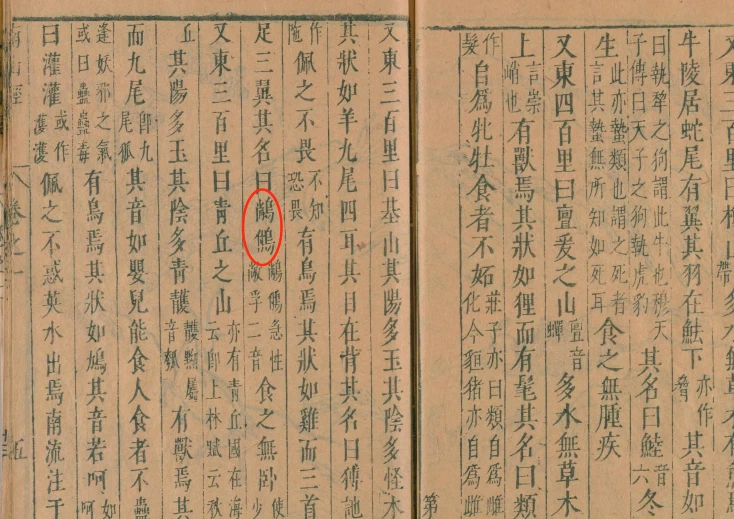
Use or build large character sets. For example, the six-legged, three-winged bird “(尚鸟)(付鸟)” mentioned in the “Classic of the Southern Mountains” (as pictured) doesn’t exist in standard Song or Ming typefaces — you need to load supplementary character sets just to see it rendered properly.
It strikes me that the survival of the Classic of Mountains and Seas across the centuries was no easy feat. Ancient printing methods were utterly different from today’s — every single character had to pass through a woodblock carver’s hands. Compared to modern technology, the sheer scale of that labor is hard to imagine — and it’s proof, too, of the truth that fine work takes time.